HomeMi CasaTutorialsInteriors etcMurals and ArtworkPainted Furniture

Saturday, March 30, 2013

EASTER BUNNY, SPECIAL ORDERED, JUST FOR ME!!

                                                           HAPPY EASTER, EVERYONE!

Because I'm always painting or gardening and ALWAYS in coveralls, I couldn't resist this cute Easter Bunny in her cute coveralls.  When I found it, I thought it must have been special ordered, just for me.  Hoping everyone has a very special day, tomorrow.

Thursday, March 28, 2013

MAKING A NEAT TABLE EVEN BETTER WITH PAINT & TWIG CHANDELIER TUTORIAL

Saundra designed her beautiful/wonderful new outdoor living area with outdoor kitchen...it is really nice!!  She's a designer and found this table when she was at market, loved the shape and texture for her new outdoor living space.  The color wasn't what they were hoping for, but she knew who could fix that for her!!  Soooo, she called me to help her make it better.


The base had those reddish brush swipes on it, but the top didn't and the top was a little lighter in color.    
Saundra asked me to match the color and paint those swipes on the top.  I mixed red and brown paint and got really close to the color on the base and, then I did brush strokes to match the design on the base.

Next, I used a very dark brown that I mixed and brushed on and wiped off, leaving a lot of the dark in the wrinkles and crevices.


Now, the table looks so good with the rest of the furniture on her patio.  
The last thing was to apply a clear sealer.  It's a bit shiny in this photo, but the sheen will go down as it's curing and will help the table look old and stoney.


I wanted you to see this light fixture/chandelier.  It's a bunch of twigs and is perfect for this outdoor living area.

Twig Chandelier Tutorial

Find a chandelier, old or new, that is a shape you like.  Cut lots of twigs, just the right size and hot glue them onto the chandelier.   Be sure to keep the twigs away from the hot lights.  The lights get very hot and that could be a problem!!  I think you could hang it anywhere.  You could tie ribbons on it or you could hang  a few crystals on it, hot glue birds on it, etc.  
Have fun designing your Twig Chandelier!
(I did not make this chandelier, just wanted to share it with you)

Sunday, March 24, 2013

HAND PAINTED (TROMPE L'OEIL) CLOTHESLINE IN A LAUNDRY ROOM & TUTORIAL

HAND PAINTED (TROMPE L'OEIL) CLOTHESLINE IN A LAUNDRY ROOM & TUTORIAL

My client wanted to dress up her laundry room.  She asked me to faux paint the walls and then paint a clothesline on one wall.  She left the artwork up to me and this is what I painted:
She had a grandchild, so I painted this teddy bear.
This was several years ago.  
I love going back and looking at my older photos and artwork.
They were huge SPURS fans, so I painted this t-shirt on the clothesline.  My client was really happy with her new laundry room and it's a nice surprise when you turn the corner into the room.
~
TUTORIAL
It would be so easy for someone to paint this clothesline and laundry.  There isn't a lot of detail in the artwork.  You might be more comfortable drawing and cutting out patterns of  the different laundry you want to hang on your wall.  Then, trace it onto the wall and paint it.  It would be really cute to paint this in a girl's room, too.  Maybe, something on a clothes hanger.  
Use your imagination and have fun!!

Friday, March 22, 2013

PAINTING A NEW FINISH ON AN ELEGANT WINDOW CORNICE

PAINTING A NEW FINISH ON AN ELEGANT WINDOW CORNICE

Today I was working on another pair of those very elegant cornices.  Half of the fleur de lis was a patina green and my client did not want that color in her living room.  Also, the cornices were a bright, bright gold leaf finish and she wanted me to tone the gold down a bit.
I'm seriously busy working, concentrating and I forgot to take a photo of the bright, bright gold.  In the top photo you can see a bit of the green patina that I'm covering. 
They were really beautiful, but the green and bright gold just didn't work in this room.
~
TUTORIAL
A dark chocolate brown is the color I used to darken or tone them down.  Used an eggshell paint, but you can use what you have, craft paint or whatever.  I used a small brush and painted small areas and then wiped off with a rag and left dark brown in the crevices and folds.  After I finished with the chocolate brown, I used a metallic gold and swiped my brush all over the fleur de lis, making it tie in with the rest of the colors on the cornice.  
My client was approving each step and she was very happy with the final finish.
THEN, I forgot to take a photo of the finished cornices!!  I think I will be going back for more work, next month and will try to remember to take photos.  Only one problem...if they've already been installed 20' high on the wall (above the most beautiful windows that overlook landscaping and a golf course), that could be a problem for my picture taking!!  So, be brave!  If you have something that is just too colorful, wrong color, etc.,
 use another color and age it, patina it, change it! 

Tuesday, March 19, 2013

LINDA'S NEW KITCHEN CABINETS: FROM WHITE TO A DISTRESSED, CRACKLED & GLAZED FINISH

Linda has been wanting to re-do her kitchen cabinets for a couple of years and finally got around to asking me to help her.  The cabinets were white, like her crown molding.  She was trying to decide the colors and she said, "Oh, like this leaf!  Is that possible?"  I thought the leaf was a bit pinkie, so she chose a bit more orangy red to match her back splash, granite, flooring and other things in her kitchen.  The flash from my camera made the leaf a little too bright, but I think I got pretty close!  And, I was in a hurry to leave and didn't get really good photos of the finish.  It is crackled, distressed and glazed with two different colors.  They turned out a kind of brown honey toned and match a color in her back splash.  Her kitchen ceiling is beadboard and I loved that.


Actually, the leaf is a beige and pinky color, but my flash distorted the colors.


She had two door frames and just a tiny bit of baseboard adjoining the cabinets.  I suggested that she let me do the same finish on the door frames and baseboards, only the ones that were in the corner, right by the cabinets and attached to them.  The rest of the baseboards stayed white.  It looked really nice.  I forgot to take a photo of that.  By doing that, she doesn't have a white break between sections of her cabinets.  It all flows together, really well.


She has such pretty kitchen accessories, pitchers, copper pots, dishes, etc.  But, when I'm finished with a job, I don't always get to see everything put back in place.  I would love to be able to show that to you because Linda's kitchen is so nice.  Maybe, I'll  get to go back and take more photos another time.

Thursday, March 14, 2013

LOVING THIS TIME OF YEAR!! A VIEW FROM MY STUDIO WINDOW

                          
                             "THE EARTH HAS MUSIC FOR THOSE WHO LISTEN"   
                                                            Wm Shakespeare

This is a wonderful time of year!  The birds are nesting or already feeding their young.  The early bloomers are blooming, like my white lady banksia rose.  It's climbing way up into my trees and so beautiful.  The roses are still blooming.  And, when I look out my studio window, this is what I see:


Gus is my friend and he always helps me when I have a new project.  A couple of  months ago, I asked him to build me a trellis for my wisteria because it would be blooming, soon.  The wisteria vine is several years old and was climbing on a smaller porch trellis and climbing on my roof and into the trees.    I knew how beautiful it would be, hanging over my fish pond.  And, I would be able to see it from my work room.  He, ever so gently and carefully, unwound the vines out of the trees and the smaller trellis.  He's such a nice guy!


While he was building it, I asked him not to trim on the frame, making it perfectly square and even.  I wanted all of the boards to be different heights and lengths.  I knew the wisteria would take over the whole thing and I could hang bird houses and yard art on them.  And, it will look even better, once the frame has turned a weathered gray/green.


Oh my goodness!!!  I am certainly LOVING looking out and seeing this!!!  It thrills my soul and I love seeing the red Martha Gonzales antique roses with the purple wisteria!  Just so, so peaceful and beautiful.

Monday, March 11, 2013

PAINTING & DISTRESSING A NEW BATH CABINET TO MATCH AN OLD BEDROOM ARMOIRE

PAINTING & DISTRESSING A NEW BATH CABINET TO MATCH AN OLD BEDROOM ARMOIRE

~Back to Patti~
A few years ago when she was building her home, she asked me to paint her new vanity in one of her new bathrooms to match a large beautiful armoire that was white and very distressed.  The armoire was in the bedroom adjoining this bath.
Isn't this armoire beautiful with it's mirrored front?  It, also, matches closely to the distressed finish color on her bed.
It looks like I got pretty close to the right colors.  And, it looks so nice in this bathroom.  When you walk into the bedroom you have a view of the armoire and the bath cabinet across the room.
I love the way this turned out!  and, I love the handles and knobs that she chose.

Friday, March 8, 2013

DRAWING & PAINTING A HARLEQUIN PATTERN & STRIPES ON WALLS & TUTORIAL

DRAWING & PAINTING A HARLEQUIN PATTERN & STRIPES ON WALLS & TUTORIAL

My client was redecorating her daughter's room.
She asked me to paint a harlequin pattern on her wall to match her new bedding.
There is LOTS of drawing.
I always use a pencil so I can erase any lines I'm not going to use.
~
HARLEQUIN TUTORIAL

If you want to paint a harlequin pattern on your wall, you first decide your colors and paint a base coat color on  your wall.  After that dries really well you can start drawing.  You need a pencil, an eraser and a level.  (I love my level!)  Decide how large you want the diamond shape to be.  This client wanted a smaller pattern.  I like the look of a larger pattern than this one.  On an 8' wall maybe stack four harlequins.  If you had no baseboard, each one would be about 24".  But, you have a baseboard and, possibly, a crown molding.  You have to figure and subtract a few inches so they'll fit in your space.  Next you decide how wide you want each pattern to be.  Now you start figuring and drawing.  This is why I use a pencil.  I draw a grid on the wall and erase any lines I don't paint over.  Pay close attention to your painting, making sure you skip every other diamond.  I always put a piece of tape on the diamond I WON'T be painting.
While I was working on the harlequin pattern they asked me to paint stripes in the kids' bath.  After painting the stripes I mixed a very light antiquing glaze and brushed on and wiped off with a rag.  It looked really cute.  I love the colors they chose!
~
STRIPES TUTORIAL

First, I painted the base coat.  The client told me about how wide they wanted the stripes.  I measured around the room and decided how wide they could be.  But, it's important to count the stripes and make sure that when you get to the end, you don't have two of the same color.  Even though I know how to count, I still use my yard stick and go around the room, saying to myself: "pink/orange, pink/orange".  A long time ago when I was painting stripes I had everything measured just perfectly and at the end, I had two of the same color!!!!!  Not sure how that happened, but, that's why I count around the room just making sure there are NO mistakes!  As you're painting, if you see you're going to have a few inches left over or a few inches short, it's ok to start adding or taking away 1/4" or 1/2" to each stripe.  As you're wrapping around a corner, you can cheat a little bit, too.  
It will all come out looking really nice.  
Have fun!! 

(If you have any questions, please click on "Ask Me" and I'll be very glad to help you.)

Tuesday, March 5, 2013

GEL STAINING OLD WHITE DOORS TO MATCH NEW CHERRY STAINED CABINETS

My client renovated her master bath and wanted me to paint her white doors to match her new cherry stained cabinets.  I had "before" photos of the doors, but can't find them on this new computer!!!  I'm learning, though!!


These were two white doors and door frames.
  To match her cabinets, I had to mix two different GEL stains to get close to her color.  A gel stain is a stain that can be used on a sealed or painted surface and it will give the look of stained wood.  A PENETRATING stain is mostly for new wood.  
My client will be getting new door knobs to match her new faucets.

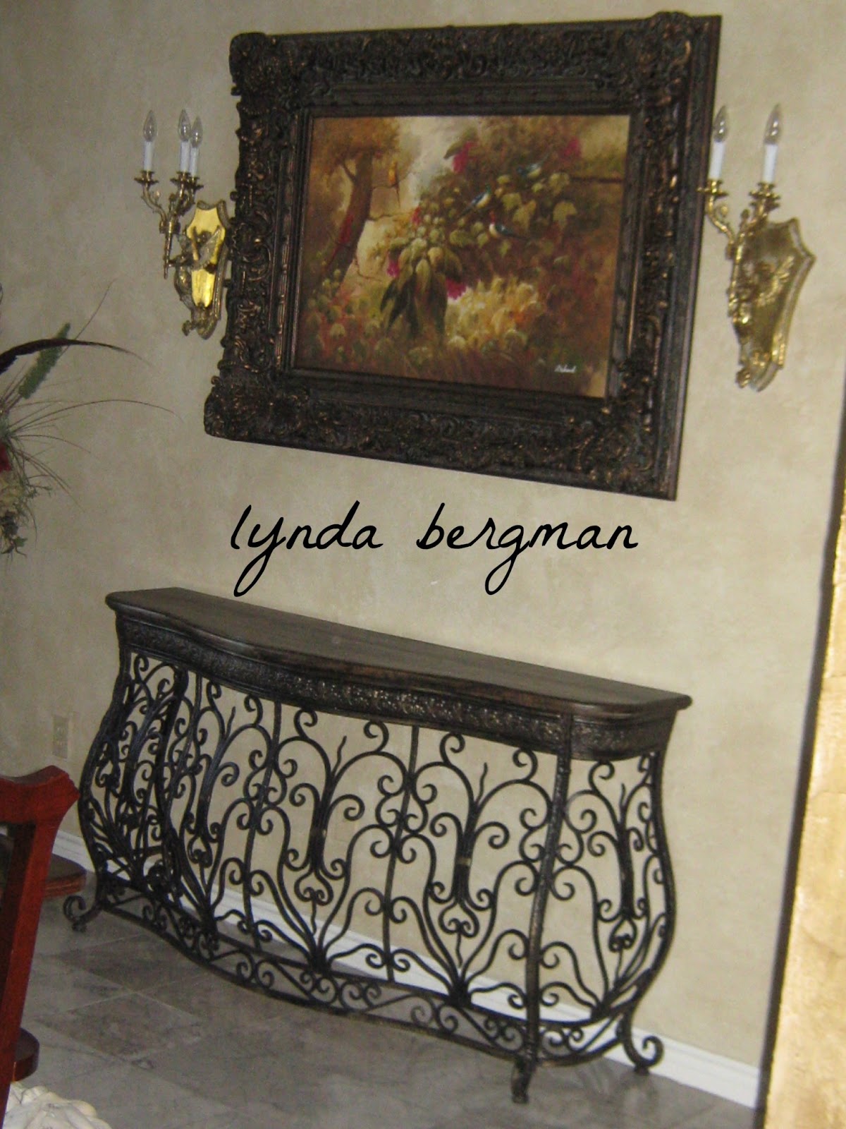
While I was there, my client asked me to paint a new decorative table to match the frame of a painting hanging above it.


The wrought iron on the table looked gray and unfinished and the table top was just wood.


Usually, I can't tell how the photos will turn out, until I see them on my computer.  The very beautiful picture frame was black and gold.  So, I painted the wrought iron black and rubbed metallic gold on lots of areas.  Then, I wiped black over the gold and aged it.
Then, I put crackle medium on the table top and while it was still tacky, I poured metallic gold on it and just kept rubbing it with a rag.  When it was dry, I rubbed the black paint on it and then sealed the table with a clear sealer for protection.  
Anytime I paint a flat surface, I seal it with two or three coats of sealer or wax it, just to protect it.  And, I always suggest to my clients that they put the little fuzzies on the bottom of any lamps, vases, etc., so they won't scratch the top.
My client was very happy with the way things turned out and I am, too!

Friday, March 1, 2013

PAINTING NEW DOORS TO MATCH A VERY OLD DISTRESSED CABINET & TUTORIAL

   PAINTING NEW DOORS TO MATCH A VERY OLD DISTRESSED CABINET & TUTORIAL

  My client found this wonderful, very old cabinet.  I believe she told me it came from Europe.  It didn't have those two little doors on it and she had two new doors made and needed me to paint the doors to match the cabinet.
It's always a challenge when I have to match an existing finish.  But, a good challenge.
(I worked on it upside down and had to rotate the photos for this post, in case you noticed! :)
The doors were the only thing I painted.  All the other staining and distressing were already there.
I started by matching the color of the wood closest to the doors.  Then, I mixed some blue colors together to get the right shade and scratched and distressed it, a bit.  
Next, I stained it heavily to match areas closest to the doors. 
 Lastly, I waxed it so it would have a protective, very low sheen finish on it.
It's such a beautiful piece and I'm so glad she brought it to me to work on.  Just looking at it is inspirational for other pieces I might want to paint.
Thank you, Patti!!
(I told you she had great taste!  She finds the most interesting pieces!!)

Just received this email:  "John LOVED the cabinet! Thanks for your hard work. Love, P"
Always so nice to get it right!!

Below is  the "before" picture.  I had already started trying to paint the blue.  
The doors were raw wood when I started trying to match the finish on the cabinet.
UPDATE: FINALLY RETRIEVED "BEFORE" PHOTOS FROM MY OLD, BROKEN, GONE KAPUT COMPUTER