HomeMi CasaTutorialsInteriors etcMurals and ArtworkPainted Furniture

Thursday, September 17, 2015

PAINTING A BLUE PLUMBAGO CANVAS FOR KAREN'S FRONT PORCH

PAINTING A BLUE PLUMBAGO CANVAS FOR KAREN'S FRONT PORCH

Remember, I painted artwork on Karen's front door and garage door?
Well, she was looking through my stash of "getting started" canvases and she came across this one.  She told me what she wanted and asked me to finish it for her front porch.
A large piece of plywood is a sturdy backdrop.  
I hang my canvases on a nail and it's a perfect height for me to work.
Karen and I hung this painting on her front porch.  She has blue cushions in those wicker chairs.  When they bloom, her arch is covered with pink roses.  
She wants blue, blue, blue everywhere and it's looking really beautiful.  
She is going to paint those brown porch rails blue, too.
Recently, Karen had the front of her house landscaped with tons of pink, purple and blue flowers.  It really does look nice.  The stair rails and pots will be painted blue.
HERE IS A LINK TO HER FRONT DOORS THAT I PAINTED:

Saturday, September 12, 2015

SPRUCING UP LUZ'S FRONT PORCH WITH MATCHING PAINT COLORS

SPRUCING UP LUZ'S FRONT PORCH WITH MATCHING PAINT COLORS

Luz asked me for suggestions on improving her front porch.
Her beautiful red front doors were the first thing I noticed. 
 She was wondering about painting blue somewhere and I told her how beautiful that shade of red was with her house colors and I thought she should keep it.
What I did notice was that WHITE wood trim above her doors and suggested she let me paint it red.
I was going to paint that tiny white sunburst trim, too, but when I got up there on my ladder I realized it was in between the window glass.  Then, when I stood back and looked at everything, I noticed that her two front windows had white sunbursts, too.  So, everything matches, now.
To me that looks so much better.  It looks really nice walking up to her front doors. 
 It makes it look "grand".
The other thing I noticed and the first thing I suggested to her was to paint her rain gutters the brick color to make them disappear.  They were painted the dark gray of her wood trim.  So many times I notice that gutters are painted like the trim on a house instead of matching and blending in with the house color.  To me, when they're a different color than the house, it looks like they're "featuring" their gutters and that's all I see.  Once Luz painted her gutters, they disappeared and my eyes went straight to her beautiful red doors. 
She asked me to paint a scrollie design on each door.  She decided she wanted less metallic gold and more of the darker color and I forgot to take a picture of the re-do.
These are the wreaths she had on each door.  Aren't the colors scrumptuous!!  
They look absolutely beautiful on those red doors.
This is Luz's beautiful home.  I really like the shade of browny gray she painted her shutters and trim.
Notice how the gutters match the house.  Before, they were the shutter color. 

Saturday, September 5, 2015

PAINTING LISA & BRAD'S KITCHEN CABINETS A GLAZED OFF WHITE FINISH

PAINTING LISA & BRAD'S KITCHEN CABINETS A GLAZED OFF WHITE FINISH

Lisa and Brad asked me to paint their kitchen cabinets.  
The cabients had an older pickled/white washed finish on them.  
Lisa and Brad saw some cabinets I painted at their friends' house.  The finish was a dark glazed finish.  I showed them a sample of that darker finish and they thought that's what they wanted on their cabinets.  
Then, Lisa asked me to paint some samples for her that were off white and glazed.
After seeing the lighter samples, she decided to go lighter in her kitchen.  She has lots of white woodwork and thought everything would look better.  
It was a really good choice because her kitchen is really beautiful, now.
Notice the painted switch plate.  It looks so much better than the white switch plate. 
They pulled the refrigerator out so I could paint the cabinets behind and above it.
Since they really liked the darker finish, they decided they wanted me to paint their island that color.  It's such a nice contrast to her lighter cabinets.
They are going replace the tile with a butcher block counter top.
Also, Lisa was looking for hardware for the cabinets.  
I know it will all look beautiful when she's finished.
This is sweet, sweet Belle.  She was a rescue from a long time ago.  She's afraid of the sounds of rain.  Probably the thunder.  So, one day it rained when I sitting on the floor working on the lower cabinets and she kept trying to get in my lap.  Poor baby!  I kept telling her no and she finally laid down beside me until it stoppped raining.  Paint and lap dogs do not mix.
Her switch plates were white and I painted them to match her tiles.  She had some extra tiles and I took them and the switch plates home with me to work on them.  It's better for me to work at home because I'm never quite sure which colors I will be needing and alllll of my colors are in my studio.  Lisa got new wooden switch plates and I painted them with craft paints.  
Then, two coats of sealer for protection. 
This is the glazed finish I painted on her cabinets.  I primed them and painted an off white finish.  Then, glazed and sealed.  Notice that I painted the tiny trim at the top of her upper cabinets and the tiny trim around her door panels, a little darker for an accent.  A subtle accent.  Lisa thought she wanted a "creamy" color and I suggested a more very light browny gray for the glaze.  I've noticed if you don't have a lot of natural light in a room, the "creamy" color looks really yellow.  
So glad she's very happy with this color.
A couple of years ago, I stained her stair railings.  These were pickled/white washed, too.
Remember the kitchen I painted for Kathryn and Sean a few months ago?  Well, they are Lisa and Brad's friends and that's where they saw the darker cabinets.
Here is a link to that kitchen:
Here are the "before" pictures of Lisa's kitchen and butler's pantry.
I love that she mixed the lighter and darker colors in her kitchen.  It really does look beautiful in the layout of her kitchen, breakfast and family room all open to each other.
Thank you Lisa and Brad!

Sunday, August 23, 2015

PAINTING TWO MORE BUTTERFLIES FOR KAREN'S GARAGE/CARRIAGE HOUSE DOORS

PAINTING TWO MORE BUTTERFLIES FOR KAREN'S GARAGE/CARRIAGE HOUSE DOORS

Remember the garage door that I painted a few weeks ago?
 Karen wanted it to look like two carriage house doors that open in the middle.
Here is a link to that post:
I painted butterflies and vines on the door(s).
Karen called and wanted me to paint two more butterflies.
Next time I'm over that way, I'll paint a little more black on the caterpillar part of the butterfly.
I loved painting the butterflies.
From the street, it looks like my painted vines might be a part of the foliage in the pot by the garage door.  In the winter my vine will be the only thing green.
I love working with Karen.

Saturday, August 22, 2015

PAINTING A BASEBALL WALL TIPS WITH ERIN

PAINTING A BASEBALL WALL TIPS WITH ERIN

Erin was painting a baseball wall for her son's room.  She messaged me for a couple of details and I thought this conversation might be helpful to other's, too.  
I asked and she said she didn't mind if I shared.
A link to:

hi Lynda
I was wondering if you could clarify for me if you painted the red baseball stitching on the wall before applying the glaze, or after applying the glaze? I am doing this in my son's room this week and I am not sure exactly when to put the glaze coat over the base color on the wall....
Thanks! !
Erin
Hi Erin,
     I painted everything on the wall before I glazed.  I wanted everything to look old.  The glazing aged the red stitching and everything. 
     Have fun with your project.
Lynda
Thank you for your response!!
One other question  (sorry)... what did you use for glaze? (Color, Type , etc)
I mixed my own glaze.  It might have been Pratt & Lambert, but you can get any clear glaze and add color to it.  Also, any of the paint stores have antiquing or aging glazes.  
"Lynda
Thank you for your helpful tips!  It turned out so cool!"
And, it did!!
DIDN'T SHE DO A GREAT JOB!  I BET HER SON LOVES IT, TOO.

Tuesday, August 18, 2015

PAINTING KIMBERLY'S KITCHEN CABINETS FROM DARKLY STAINED TO AN OFF WHITE COLOR

PAINTING KIMBERLY'S KITCHEN CABINETS FROM DARKLY STAINED T AN OFF WHITE COLOR

This was Kimberly's kitchen "before".
I thought her cabinets were beautiful, but she did NOT like them.  She said she thought the previous owner had painted them and they did not do a good job.
When I started painting them they were sticky and I thought they might have used the wrong stain.  A penetrating stain can take forever to dry on an already painted surface and that's what I thought the previous owner might have done.  Also, some paint products are not compatible with each other and that could have left them sticky, too.
Kimberly thought she wanted them dark again, but a little different finish.
I showed her this picture of one of my cabinet finishes and she loved it.
Here is a link to that post:
I kept thinking it was going to look really dark like her original cabinets, but that's what she wanted.
So, I got started and used an oil based primer to cover the stain.  I always tint my primers to be a better undercoat for my top coat color.  As I was painting the lighter primer I kept thinking it looked really good with her granite, floors and stone.
When Kimberly came home, she was amazed at the lighter color and LOVED it.
She asked if I could just seal over the primer and leave the cabinets that color.  Yes, I could do that.  I painted a second coat of primer for a more solid coat and then sealed the cabinets.
The color really did look good and was such a contrast to those darker cabinets.
Here's little Paisley, again.  Her coat colors are so beautiful!
Thank you to Kimberly and your beautiful family.

Sunday, July 26, 2015

STEPHANIE'S NEW VENT-A-HOOD (PAINTING MY FAUX "ANTIQUE COPPER" SPECIAL FINISH)

STEPHANIE'S NEW VENT-A-HOOD (PAINTING MY FAUX "ANTIQUE COPPER" SPECIAL FINISH)

A couple of years ago, I painted for Stephanie's neighbor.
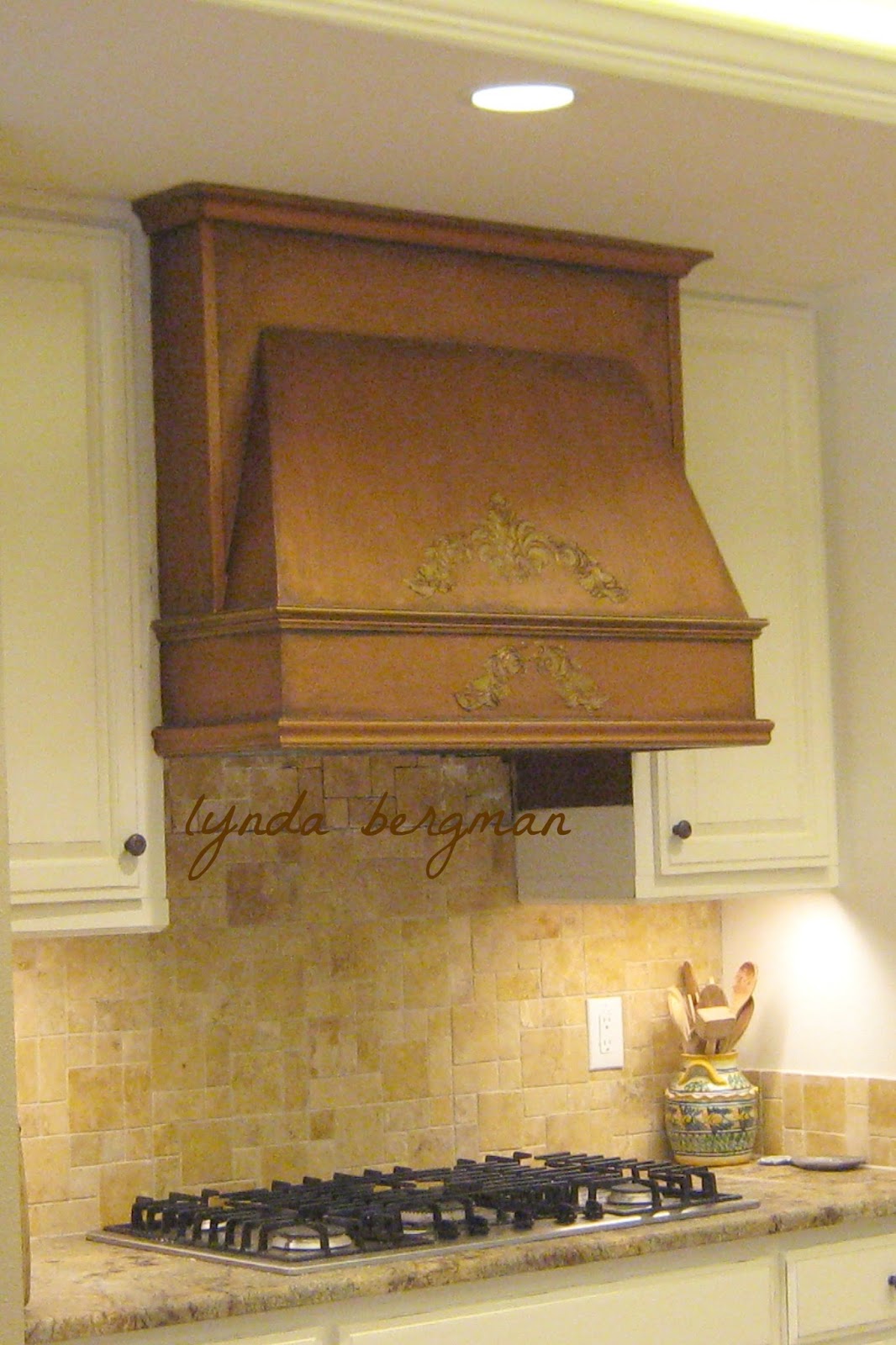
I painted my "antique copper" finish on their newly built wooden kitchen vent-a-hood.
So,  when Stephanie was remodeling her kitchen, she had a carpenter build her a wooden vent-a-hood, too.  She liked how I painted her neighbor's, so a few weeks ago she asked me to paint her vent-a-hood with my "antique copper" finish.
She has a beautiful copper chandelier in her breakfast room.  So, I mixed my metallic copper paint to be a similar color shade, but not exactly.  Sometimes the metallic copper paint is a little too orange, so I mix other  metallic colors to get what will blend in my clients' homes.  Also, she has different copper pots and accessories around her beautiful kitchen and breakfast room and it all ties in very nicely.  The back of her house has lots of glass walls, looking out over her huge yard.  I loved looking out while I was working and I could hear the hawks and other birds calling.  
Stephanie told me that they have a house in Ireland where they visit two or three times a year.  She said it's a small village and it's filled with artists.  I think she said if you're an artist, you don't have to pay taxes.  The town feels like it makes them more appealing to visitors.  She said they have puffins and they're fun to watch and very interesting.
I think I would love to live in a small village in Ireland!
Here is a side view, so you can see the shape.
Here are Molly and Louie.  Very, very sweet dogs. The gate between the two neighbor's houses is always left open so the dogs can visit back and forth.  They get treats and take naps and then go home.  I thought that was sooo cute.  And, while I was painting for Stephanie, they went next door to visit a couple of times.
Here is a link to the neighbor vent-a-hood job:
First, I showed Stephanie several stencils so she could pick out the design that she wanted on the front.  Then, I measured and embossed the design.  Next, I primed, painted the metallic copper, painted metallic gold on the embossed design and then aged it with dark paint.  You can see that I painted a couple of the trim pieces with the metallic gold, too.  If you paint with metallic paints, remember that metallic paint "reflects", so make sure you have a light source to show off your faux metal look.
This is the "before" picture.
I love how everything turned out and from the breakfast and living rooms, it really does look like it might be copper.  
That's what I was going for!
Thank you, Stephanie! 
 I really enjoyed working with you and the doggies.
~
HERE IS A LINK TO MY INSTRUCTIONAL eBOOK